

Colors - more than what we see
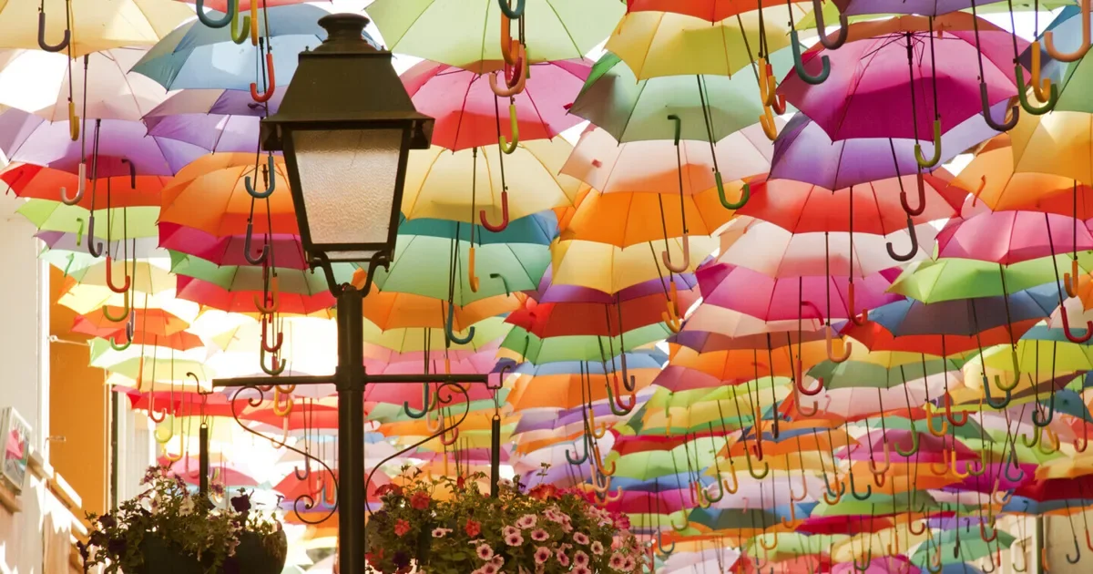
Walking through a special exhibition of Aveiro’s museum of modern art, I became aware that colors are much more than something just visual. It is cultural. It is physical. It is chemical. IT is personal, and deeply emotional. I began to wonder what makes us choose certain colors, why we feel drawn to certain ones? Why does Blue feel calming, whereas Red feels rather intense? And what do colors represent across different cultures?
The Physics & Chemistry of Color
At its origin, color is not something objects have—it is something that happens between light and matter. Light travels through the world as part of the electromagnetic spectrum, carrying energy in different forms.
The colors we perceive are only a small fragment of this spectrum, each defined by its wavelength and energy. Blue light, with its short wavelength, carries high energy, while red light stretches longer and moves with less intensity.
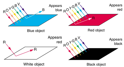
When light meets an object, it gets selected: Not all wavelengths are reflected back to us. Some are absorbed, taken in by the material itself. What we finally see is what remains—the light that was not absorbed. A red surface, for instance, holds back most other colors and releases red light into the world, which then reaches our eyes. What appears so immediate and obvious is, in reality, a subtle act of filtering.
If we move into the microscopic world, inside molecules, electrons respond to light in precise ways. When light touches them, it can lift them into higher energy states—but only if the energy fits exactly. Each molecule, in this sense, has its own language of color, defined by what it can and cannot absorb.
Some molecules, especially those found in nature, allow their electrons to move more freely, spreading across larger structures. These “delocalized” electrons create the possibility for visible color. The more space electrons have to move, the lower the energy they absorb, and the color shifts toward red. When they are more confined, they absorb higher-energy light, and the color moves toward blue.
Nature as a Chemical Color System
Nature does not simply display color—it creates it, continuously, through chemistry in motion.
In the green of leaves, for example, color is the result of a delicate balance:
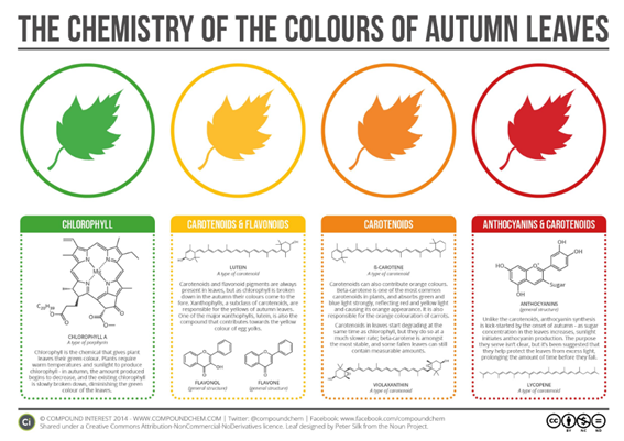
Chlorophyll, the pigment responsible for photosynthesis, absorbs red and blue light from the sun, reflecting green back into the world. What we perceive as the “natural” color of leaves is, in reality, what remains after this silent selection.
Alongside chlorophyll, other pigments exist, often hidden until conditions change.
Carotene, for instance, absorbs blue light and reflects yellow tones. It is always present, but only becomes visible when chlorophyll fades—like in autumn, when green slowly gives way to gold.
Even more fluid are anthocyanins, pigments that do not settle into a single identity. Their color shifts depending on the chemical environment surrounding them, especially the acidity of the cell. The same molecule can appear red in acidic conditions, and transform into blue or purple when the environment becomes more basic.
Color, in this sense, is not something that is. It is something that is constantly becoming.
Psychology of colors
Color does not only exist in the world around us—it comes alive within us. What we see is not simply light reflected from surfaces, but a perception shaped by the brain, the body, and everything we have learned to associate with it.
From an evolutionary perspective, our sensitivity to color carries meaning that goes far beyond aesthetics. Subtle shifts in skin tone—barely noticeable—once signaled survival-relevant information.
A flush of red could indicate increased blood flow, emotion, dominance, or attraction.
A pale or bluish tone might suggest illness, stress, or fear. These cues became embedded in perception, shaping how we interpret others long before conscious thought begins.
Even today, these traces remain. Certain colors seem to reach us more directly, almost instinctively.
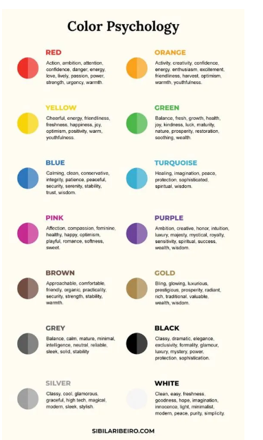
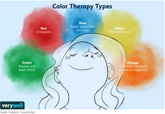
Red can heighten arousal, draw attention, and amplify a sense of urgency or intensity.
Blue, especially in the form of light, has been shown to influence alertness and cognitive performance, interacting with biological rhythms linked to daylight.
Black, in some contexts, carries associations of power or aggression, while green often evokes calmness—perhaps because it echoes landscapes where life thrives.
But these effects are not fixed truths. They are tendencies, shaped and reshaped by context.
In controlled experiments, red has been found to impair performance in high-pressure cognitive tasks, possibly by triggering avoidance or anxiety. In other situations, the same color can enhance attraction or signal confidence. Blue light can increase alertness in a workplace setting, yet feel cold or distant in another environment. The meaning of color shifts depending on where we encounter it, what we expect, and who we are.
This is where the limits of color psychology become essential: Despite its popularity, the idea that colors carry universal, predictable meanings—blue is calming, red is energizing—is an oversimplification. Scientific research shows that color effects depend on a complex interaction of factors: cultural background, personal experience, situational context, and even the specific shade, brightness, or combination of colors present.
Color does not dictate how we feel. It nudges, suggests, and interacts, but what we perceive, in the end, is not just color itself—but a layered experience where biology, memory, and environment meet.
Color and Healing

Walking through the museum in Aveiro, I came across this window—structured, geometric, yet quietly alive with color. It was not random. At the beginning of the 20th century, architects began to think of color not only as decoration, but as something that could influence how we feel, even how we heal. In hospitals, blue tones were often deliberately used in stained glass, tiles, and walls to create a sense of calm, clarity, and restoration. Light filtered through colored glass was meant to soften the atmosphere, to ease the mind of patients, to create a space where recovery felt possible.
Looking at this window, it becomes clear that color was already understood—intuitively, if not fully scientifically—as something that shapes experience. The blue is not just blue. It is light slowed down, softened, transformed into something almost gentle. The red and green accents do not disturb it; they hold it in balance.
And maybe this is where science, architecture, and emotion meet: in the quiet belief that the environments we create can support the body—not only physically, but also through color, through light, through what we allow ourselves to see.
Can colors heal us ?
We often speak of colors as if they could heal us. Soft blues are described as calming, greens as restorative, warm tones as comforting. These ideas appear in hospitals, meditation spaces, and even in the way we design our homes. But what does it actually mean for a color to “heal”?
From a scientific perspective, colors do not heal in a direct, medical sense. They do not act like a drug or a treatment. Yet they can shape the conditions in which healing becomes more possible.
Light and color influence the body in subtle ways. Exposure to certain wavelengths—especially blue light—can affect alertness, circadian rhythms, and cognitive functioning. Environments rich in green tones, such as natural landscapes, have been associated with reduced stress and improved well-being.
These effects are not caused by color alone, but by what color represents and how the brain interprets it.
Because color is never just visual—it is relational.
A soft blue may calm not because of its wavelength alone, but because it reminds us of water, of sky, of openness. Green may feel grounding because it echoes environments in which humans have evolved for thousands of years.
These associations are carried in memory, shaped by experience, and reinforced over time.
In therapeutic and artistic contexts, color is often used as a tool for emotional expression. People are drawn to certain colors during different phases of their lives—sometimes intuitively, without fully knowing why. Choosing, wearing, or surrounding oneself with a color can become a way of externalizing an internal state - Not as a cure, but as a language.
At the same time, the relationship between color and emotion is not universal. A color that soothes one person may unsettle another. Cultural background, personal history, and context all shape how color is experienced. Even the same color can feel different depending on its intensity, its combination with other colors, or the light in which it appears.
So perhaps color does not heal us directly. But it can create space. Space for calm, for reflection, for expression. Space in which the body and mind can shift—subtly, quietly—toward something softer.
And maybe that, in itself, is a form of healing.
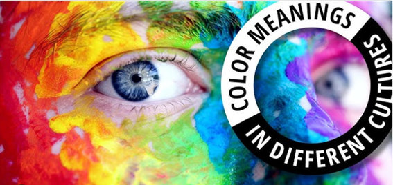
Culture of colors
Colors are not only perceived—they are learned. They carry stories, histories, and meanings that are passed down through cultures, rituals, and everyday life. What a color “means” is rarely universal. Instead, it is shaped by the environments we grow up in, the symbols we are surrounded by, and the associations we learn over time.
White, for instance, often evokes purity, simplicity, or new beginnings in many European contexts. It is the color of weddings, of clean spaces, of something untouched. Yet in parts of Asia, the same color is worn in moments of grief, marking loss, transition, and the presence of death.
Red moves just as fluidly across meanings. In many Western cultures, it is tied to love, passion, and desire—but also to warning, danger, and urgency. In China, it carries a very different emotional tone: red is the color of celebration, prosperity, and luck, deeply embedded in festivals, weddings, and everyday symbolism.
Black, too, shifts depending on where and how it appears. In fashion, it is often associated with elegance, minimalism, and control. In other contexts, particularly in Western traditions, it becomes the color of mourning, of endings, of the unknown.
These meanings are not inherent to the colors themselves. They are built through repetition, through shared experiences, through language and metaphor. Over time, they become so familiar that they feel natural—even though they are culturally constructed.
Psychological research supports this idea: the way we respond to color depends strongly on context. A single color can evoke entirely different reactions depending on where it appears and what it is associated with. A blue ribbon may signal achievement, while the same blue tone on food might feel unnatural or even unsettling.
Color, then, does not carry a fixed message. It speaks a language that changes with place, time, and experience.
And as we move between cultures, we begin to see that what feels “obvious” in one context is simply one version of many possible meanings.
History of color
Long before science could measure wavelengths, philosophers tried to make sense of color through observation and meaning. Aristotle described colors as emerging from the interaction of light and darkness, linking them to the fundamental elements of nature. For him, color was not just physical, but part of a broader order of the world.
Centuries later, a different way of seeing began to emerge. In the 17th century, Isaac Newton passed light through a prism and revealed that white light is not pure, but composed of many colors. With this, color became measurable, divisible, and grounded in physics—a property of light itself.
And yet, this was not the end of the story.
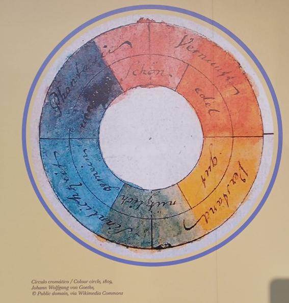
In the early 19th century, Johann Wolfgang von Goethe challenged Newton’s purely physical explanation. He was less interested in light itself, and more in how humans experience color. For Goethe, color lived at the boundary between light and perception, carrying emotional and psychological weight.
Between these perspectives, a quiet tension has remained:
On one side, physics seeks objectivity—color as wavelength, as measurable reality.
On the other, art and philosophy explore subjectivity—color as feeling, as experience.
Both are true, yet neither is complete on its own.
Throughout history, color has also been deeply tied to power, identity, and access. Certain pigments were rare, expensive, and difficult to produce, and therefore became symbols of status. Purple, for example—once extracted from sea snails in a labor-intensive process—was reserved for royalty and elites.
In religious art, colors carried spiritual meaning. Gold reflected divine light, blue was often associated with the sacred or the infinite, and red symbolized both sacrifice and life. These meanings were not accidental; they were carefully constructed and repeated across centuries.
From Synthetic Brilliance to Natural Return
With the rise of chemistry in the 19th century, color entered a new phase. Synthetic dyes transformed textiles and art, making vibrant colors widely available for the first time. What was once rare became accessible, and color shifted from a marker of exclusivity to a tool of expression.
But this transformation came at a cost—one that remained largely invisible for a long time.
Synthetic dyes, while powerful and stable, often rely on complex chemical compounds. Many of them are resistant to degradation, meaning they persist in the environment long after their use. In textile production, large volumes of dyed wastewater are released, sometimes insufficiently treated, carrying colorants, heavy metals, and other additives into rivers and oceans. What gives fabric its intensity can, in another context, disrupt aquatic ecosystems, affect microorganisms, and interfere with biological processes.
In this sense, color does not disappear. It travels.
Today, a subtle shift is taking place. In response to growing environmental awareness, there is a renewed interest in natural dyes—methods that existed long before synthetic chemistry reshaped the industry. These dyes are derived from plants, minerals, and sometimes insects, and they carry a different relationship to the environment.
Stay tuned for more cool info :-)
References:
Elliot, A. J. (2015). Color and psychological functioning: a review of theoretical and empirical work. Frontiers in Psychology, 6:368
Chandrasekaran, J. (2001). Chemistry of Colours. Resonance – Journal of Science Education.
Kant, R. (2012). Textile dyeing industry an environmental hazard. Natural Science, 4(1), 22–26
Yaseen, D. A., & Scholz, M. (2019). Textile dye wastewater characteristics and constituents of synthetic effluents: a critical review. International Journal of Environmental Science and Technology, 16, 1193–1226
Ogugbue, C. J., & Sawidis, T. (2011). Bioremediation and detoxification of synthetic wastewater containing triarylmethane dyes. Journal of Environmental Management, 92(4), 1347–1358.
Pinheiro, H. M., Touraud, E., & Thomas, O. (2004). Aromatic amines from azo dye reduction: status review with emphasis on direct UV spectrophotometric detection. Dyes and Pigments, 61(2), 121–139.
Bilińska, L., Gmurek, M., & Ledakowicz, S. (2016). Comparison between industrial and simulated textile wastewater treatment by AOPs.. Chemical Engineering Journal, 306, 550–559.
Samanta, A. K., & Agarwal, P. (2009). Application of natural dyes on textiles. Indian Journal of Fibre & Textile Research, 34, 384–399
https://www.verywellmind.com/color-psychology-2795824
https://www.colorpsychology.org/
https://www.science.org/content/blog-post/chemistry-colors-images-and-reality
Images from:
https://openbooks.lib.msu.edu/collegephysics2/chapter/color-and-color-vision-2/
https://www.chemie.de/infografiken/10/the-chemicals-behind-the-colours-of-autumn-leaves.html
https://www.verywellmind.com/color-therapy-definition-types-techniques-and-efficacy-5194910
https://www.insistrum.com/post/colour-psychology-vol-1-what-is-colour-psychology
https://www.centerofportugal.com/pt/tour/rota-da-arte-nova-aveiro